


Inflection not perfection
...on exploring messy ideas (and myself)

This post will not be an essay like the last one, exploring the borderlands between truth and manipulation, it is much simpler – but has been much harder to write. It's a personal reflection on how I take apart a few ideas and make it meaningful for me, why it doesn’t always work, and how doubt stops me press ‘publish’. It goes deeper into my digital image making process, and I leave you to decide how much 'truth', meaning or value comes out at the end. My AI writing companion and editor has been put back in his box for this one, so less polish and more authenticity I hope.
Challenges elsewhere in life and the world have also brought me down to earth – work, global politics (WTF!), understanding ADHD (what to make of it, how to understand it, excuses vs reasons etc), solo travel, the usual complications and busyness of day to day, all making me a few steps away from where I need to be to engage with the creative process. And my process needs – I need – to channel some of that into the work to make it feel relevant and worthwhile. Bring to life things that can't be said (at least by me), and perhaps shouldn't be said, but shown.
The shortcomings of a brief
The brief I wrote (brainstormed) for myself in ‘Blank Canvas Thinking’ for the next installment of Inflection, the creative relay race with Karen Topp, was a starting point but not a description of the next image in the series. The word cloud of ideas I generated showed up my rather annoying tendency to create a great concept with no idea how to actually do it (I love a good list/plan/concept, even if I don’t do anything with it). It was another prompt, and the thoughts I had on the ideas of 'urban', 'disconnected' and 'parallel lives' and ‘stories untold’ seemed too hard – too far away – to tackle head on. This is particularly true as my approach is usually unscripted and responsive (to the environment I happen to be in) rather than pushed in a particular direction beforehand.
As I couldn't find my way into the brief for my normal process, I needed a new tack. A more experimental approach perhaps, which worked for me so I could just 'get going', but risked not connecting the ideas for others viewing. (Maybe this post is my attempt to bridge that gap). After all there’s nothing worse than a bad brief! (there’s actually a whole web site devoted to it…)
When you can’t zig, zag
The key, with all these creative processes, is to start. To have something to react to and improve, to check the 'fit' with the ideas in my head. I liked the idea that Karen used for the process to get to her first response in the series, literally dissecting my image and the elements within to find new elements. That could be a good starting point I could try.
To have more freedom to explore, I went back to my digital base camp, photoshop, to layers and to masking, multiplying and overlapping images to see what works, what speaks and what is missing. What is missing will be my brief to take new images.
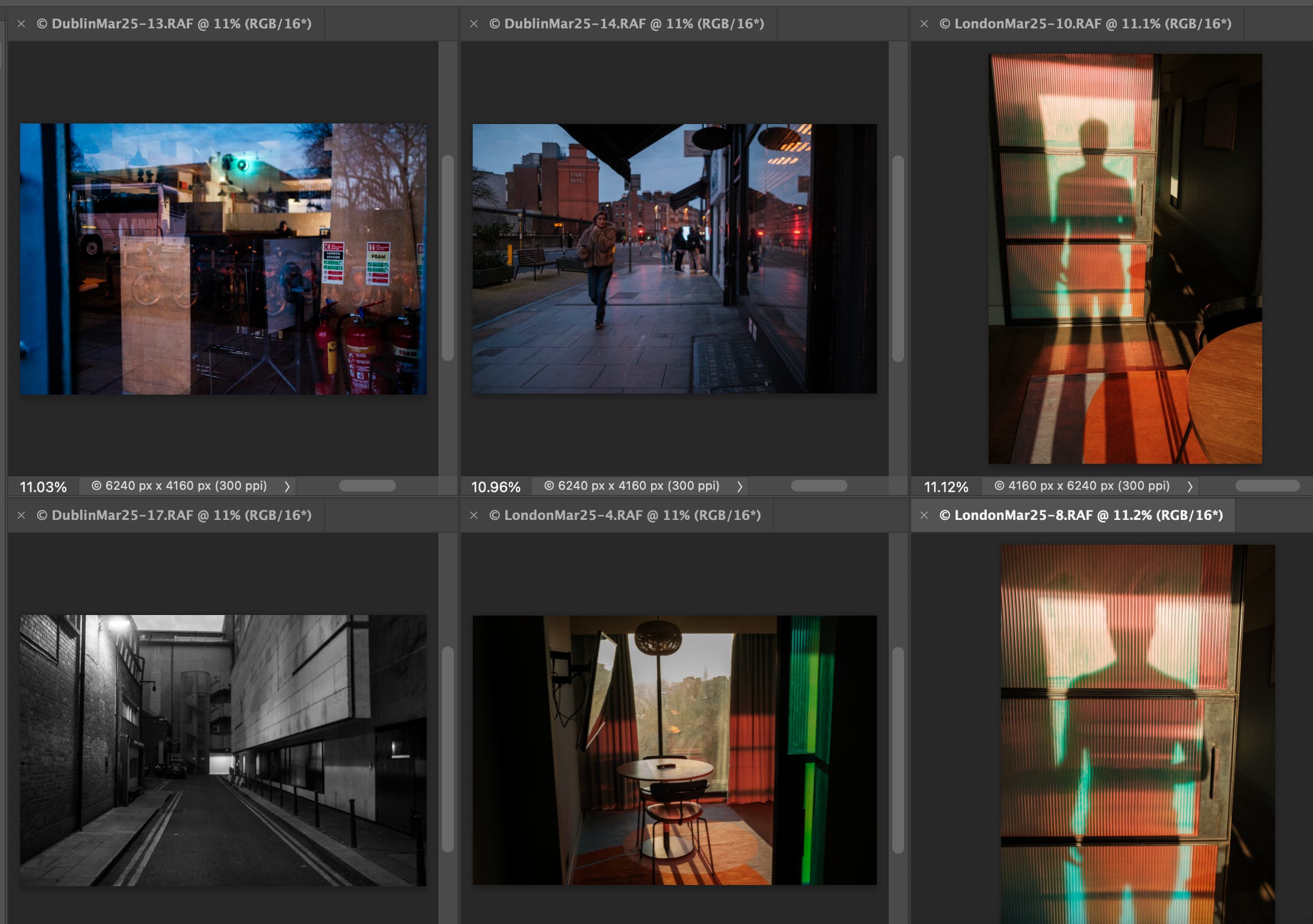
But before lighting the burners, the ingredients I have already need prepping. Images 'in the bank' that speak to those key terms, some new ones I hadn't looked at yet, to assemble and 'lay them out' to see understand how they fit.
Experiments and hypotheses
The centre of gravity of a good brief is always a clear, uncompromising truth or need. This is as true for a brief for a marketing agency as it is for an artist. My 'planetary mass' for this project is the fragmentation and messyness of life, multiple lives, parallel and hidden human challenges. I needed to show this above all, everything else that follows is simply what flavours the dish. It speaks to Karen's dissection of my image, of the multiple parallel lives that jumped out at me, and the reflection of my own jumbled psyche right now. This seems true, for me.
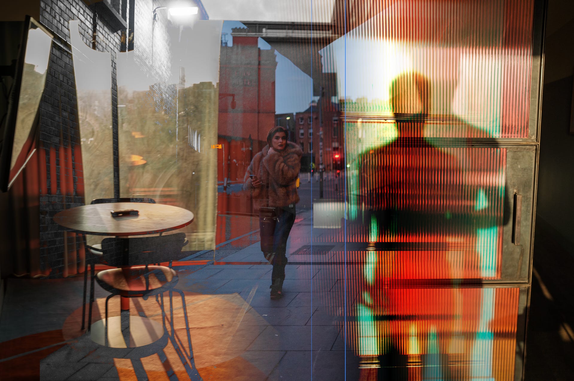
I priortised my images, ready for slicing and dicing. I focus on the key image, the view of my empty London hotel room and my shadow on the opposite wall. I add the picture of Dublin dead end street, the photo of a late night commuter passing by to give elements of a city, a hidden story, a journey. I look for what I'm missing from Karen's preceding image set. Perhaps a texture that gives subtle interest, a stronger frame, and more variety in colour to give depth, to draw the viewer in.
This created options.


Order to the chaos
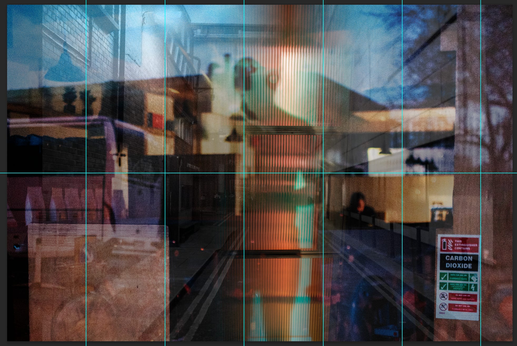
Next to aid composition I use a grid to get elements to snap into place, create a visual rhythym and structure to lead the eye around the image. This tightens the composition. As usual – this pretty much always happens – I take a step back and decide it's all too boring, one dimensional.

Final-ish touches
In the final stage I have the ingredients, I have a visual ‘mid point’ and I know what I feel and what my intention is with the image. I list the attributes missing, both what I feel and what spoke to me from Karen’s triptych: humanness, imperfection, mystery, texture, uncertainty.
I don’t think I can easily break down the process from here, except to say I found new elements to add (photos, scans, found images) and slowly layered them onto the existing image, increasing or decreasing visibility until the aspects I listed above were more apparent without getting in the way of the original composition.
I will leave it here. As I said at the beginning, for me some elements can’t be written down and have to be expressed directly.
Maybe you can tell me what you think, and if it makes sense to you.

Thanks for reading.
I think it is an intriguing (final) image. I like that I (also) read about how the image came to be, that helps to 'make sense' of it I guess? (or maybe that's just me, that I need a bit of guidance ;-))